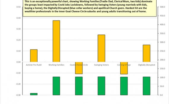
Tag Archives: esri

  • -
Are you a student studying Geography, GIS, or Spatial Statistics?

Great Opportunity

Category:OtherTags : 

Are you a student who is studying Geography, GIS, or Spatial Statistics or a mature-aged person seeking to re-enter the workforce?  We are looking to train a small team of men and women to use Esri Mapping Software which not only assists us with our mapping business but equips you for your future professional career.

Education Geographics’ Spatial Strategist and Senior Mapper Dr Jeanine McMullan has trained numerous young men and women who have used their mapping skills to secure well-paid careers as Management Consultants for top Four consulting firms, Geography Teachers at High Schools, Town Planners or Professional, full-time Mapping Specialists.

In the second half of the year, casual positions may become available for work on spatial strategy maps, with a focus on transport logistics.

If you are a mature-aged person with a similar background or have experience with Esri software and are seeking to re-enter the workforce on a part-time basis, we would love to hear from you.

To take advantage of this opportunity complete send us an email providing details and a profile about yourself to admin@elaborate.net.au


  • -
EGS Spatial Analyst and Senior Mapper Dr Jeanine McMullan has just recorded a new video

‘I really like our maps … they’re great fun!’

Category:EducationTags : 

Our EGS Spatial Analyst and Senior Mapper Dr Jeanine McMullan has just recorded a new video.

In the video, headed The Power of the Esri Map Module, Jeanine conveys her sense of excitement at being able to explore innovative new map layers of small-scale data which she can superimpose on EGS catchment maps, so schools can improve how they spatially manage their school to the benefit of their students and their families.

On a practical level, Jeanine and I explain how the layers on an EGS school map can be used to design the most cost-effective school bus routes and stops, based on ease of access from existing students and also from potential additional students, whose families match your school profile.

This means your wrapped school bus can serve as a mobile marketing platform in the most prospective streets in your catchment, as it takes your current students to and from school.

The route design can be adapted annually to changing marketing and logistics strategies, with the new layout downloaded and sent to school drivers or bus companies, and posted on school websites.

Jeanine then shows her genuine enthusiasm for new advanced features in map design which, for example, can help a school begin to estimate the environmental cost in terms of carbon credits of various transport strategies, how to make of use of emergency map layers, showing, for example, flooding risks and fire updates, as well as longer term development plans from your local authorities.


  • -
So far, so good. But what happens when we check out the profile of the 20 to 25 percent of jobs which come late to the party?

Big Data Improves with Age

Category:Labour MarketTags : 


When it comes to their new Weekly Payroll Jobs and Wages series, the ABS this week agreed with our ADS post of October 6, 2020: Newer isn’t always better (reproduced below.)

With their latest payroll data release this week, the ABS announced it would extend the time between the final payroll period and the release date, by around 9 days. The ABS says this will improve the quality of estimates, through reducing the level of imputation (by more than half) and revisions in the most recent weeks of data.

For our explanation from last October, you can read our original post below.

Newer isn’t always Better – Covid Jobs update from John Black, CEO of Education Geographics, October 6, 2020.

A week or so back we provided a profile of how the broader Australian stereotypes were faring under Covid jobs lockdowns and today we’re urging a bit of caution when it comes to rushing to judgement on the latest payroll stats – because newer isn’t always better.

Although they don’t quite put it like this, the Australian Bureau of Statistics and I both agree the payroll stats are like a fine bottle of red … you’re well advised to let them age a little after opening, before taking the first sip and rushing to judgement.

The official explanation is contained in the recent ABS release on the weekly payroll data for the week ending September 5, where you can see a section called data limitations and revisions. You can find the technical explanations through this link.

https://www.abs.gov.au/methodologies/weekly-payroll-jobs-and-wages-australia-methodology/week-ending-5-september-2020#data-limitations-and-revisions

In this section, the bureau stressed that they were trying to help policy makers during these extraordinary times, by releasing data as close as possible to the period when the activity occurred and then make the data as accurate as possible over time, but incorporating new data when it was received.

This means that the latest data is only about 75 percent to 80 percent complete and can take several months to be fully complete and so the final figures look a lot more attractive after ageing than they do when they’re brand new, as you can see below. Even two weeks of waiting can add one point to the index number for the same release.

Covid Jobs update from John Black, CEO of Education Geographics, October 6, 2020.

So far, so good. But what happens when we check out the profile of the 20 to 25 percent of jobs which come late to the party? Let’s check out our two Stereotype Charts for August 8, with the top one based on the original data and the second one also showing the revised data in yellow bars.

So far, so good. But what happens when we check out the profile of the 20 to 25 percent of jobs which come late to the party?


Suburban Stereotypes - So far, so good. But what happens when we check out the profile of the 20 to 25 percent of jobs which come late to the party?


The central thrust of the original data profiles shows the big urban and provincial city Working Families and the younger and more aspirational, outer suburban Swinging Voters both faring relatively well from the impact of the Covid jobs lockdown. By relatively well, we mean relative to a (non-Victorian) Australian average jobs loss of about three percent from mid-March to August 8.

When we take a close look at the changes in index numbers for individual occupations and the suburb profiles for where they tend to live, we see that the industries which tend to improve after revision include the better-paid ones we often find in the Goat Cheese Circle inner suburbs, such as professional consulting, finance, media and real estate.

This means our maps for the loss of jobs across inner suburbs tend to look a lot greener after a month or so, after new employer data has been reported from those employers reporting less frequently than every week.

So, until the ABS has amassed enough single touch payroll data over a few years of relatively stable labour markets, to make regular seasonal adjustments, treat the latest weekly data releases with caution, as the revised data a month or so older, is often more accurate.

Just like an old vine Barossa Shiraz, big data often improves with ageing.

Next update, we’ll take a look at the impact of the Federal Budget on those industries most impacted by jobs lockdowns.
Talk to you then.


  • -
Marketing Strategies for Schools - Looking beyond covid, spatially, Education Geographics for School Management & Marketing Strategies for education institutions in Australia.

Looking Beyond Covid – Spatially

Category:EducationTags : 

Australia is predicted to lose a million persons in the next few years, when compared to pre-Covid estimates.

These losses are likely to be highest in suburbs near universities which had previously enjoyed strong population growth, due to recent large intakes of foreign students and very high levels of net overseas migration (NOM).

Education Geographics has been working closely with Australian Development Strategies and Health Geographics to map future spatial population impacts of Covid. The work has been mentored by distinguished Australian economist Saul Eslake.

An Esri map provided through this link https://arcg.is/1yX4qD shows our projected Covid impact by SA2 on pre-Covid population estimates.


Marketing Strategies for Schools - Looking beyond covid, spatially, Education Geographics for School Management & Marketing Strategies for education institutions in Australia.

More detailed maps of target areas and numbers will be provided on request to clients of EGS, ADS and HGS.

Unfortunately, we cannot accept new school entrants in Term 1, 2021, but we have limited spaces available for new schools in Term 2.

If your school is ready to plan for your post-Covid future, complete the form below and book an interactive experience with our new 2021 Covid-ready App.


    • -

    What’s in an Age?

    Category:Labour MarketTags : 

    Covid Jobs Update from John Black, CEO of Education Geographics, October 12, 2020

    Some economists, trade unions and the Labor Opposition say the Federal Government’s JobMaker Budget proposal which subsidises wages only for eligible workers less than 35 years old should be open to eligible workers of any age. They argue that the current policy discriminates against older workers and may be open to job substitution rorts from some employers.

    And most Australian voters tend to agree with them.

    This week’s Newspoll finds the age-limited JobMaker measure to be unpopular with 57 percent of all voters, 63 percent of older voters and, worryingly for the Government, a clear majority of (mostly older) Coalition voters. Given their concerns and this lack of public support, Labor and the Greens in the Senate can smell a political opportunity and are lining up to give the enabling legislation the death of a thousand committee cuts.

    In defending its proposal, the Government draws heavily in Budget Papers on seasonally adjusted data in the monthly ABS Labour Force Survey and points to higher unemployment rates among younger workers. It also uses Government figures of 700,000 persons under 35 years on Jobseeker or Youth Allowance at the end of August.

    The problem for the Government in relying on the traditional ABS monthly Labour Force sample of about 50,000 persons is that the series has been sorely tested by the immediate and massive labour market disruption caused by emergency social distancing orders and border closures since mid-March, and then by unprecedented stimulus measures from the Federal Government with JobKeeper and JobSeeker to minimise the impacts of this disruption.

    The reliability of data produced by official sources during this somewhat hectic period is illustrated by the fact that the Taxation Office, Treasury and the Government initially estimated 6.5 million Australians would receive JobKeeper at a cost of $130 billion, only to revise the recipients down to 3.5 million and the cost down to $70 billion.

    So, some degree of caution is recommended when evaluating Government initiatives involving both taxpayers’ money and big numbers of jobs in the labour market.

    Bear in mind here the Labour Force series leverages up a random monthly sample of about 50,000 persons to estimate results for about 13 million Australian workers, which the Government has then used to justify biasing its JobMaker policy in favour of certain age groups less than 35 years old.

    The problem for the Government with JobMaker is that these leveraged results are contradicted by the new experimental ABS series based on weekly ATO payroll figures for about ten million real jobs.

    If you’re trying to understand the behaviour of 13 million workers and break it into smaller sub-groups or areas, you’d expect to be a lot better off using a weekly sample of 10 million jobs, rather than a monthly sample of 50,000 persons.

    Before you do, it’s useful to compare the two series first. See an ABS comparison here: https://www.abs.gov.au/methodologies/weekly-payroll-jobs-and-wages-australia-methodology/week-ending-5-september-2020#differences-to-labour-force-employment-statistics

    Figure 1 below, shows the national summary for age-based August payroll data by index numbers in blue, and a comparable index we constructed for the labour force sample by age groups in green.

    Figure 1 below, shows the national summary for age-based August payroll data by index numbers in blue

    Figure 1 shows, that despite definitional differences, the Payroll jobs and Labour Force Survey index values are similar for (combined) all ages, and for those age groups 20-29, 30-39, 40-49 and 50-59 years, with each group containing between 2.3 and three million workers.

    And both series confirm the twenty-somethings potentially benefiting from the Government JobMaker wage subsidy scheme are up to three percent worse off than the average worker and worthy of some targeted support, with appropriate safeguards.

    A large part of this poor result for twenty somethings is due to the ongoing job lockdowns in Victoria and the Victorian figures pulling down the national results. Clearly, the Commonwealth Government here has thrown a JobMaker lifeline to Victoria, without breaching its obligations to the states which have made a better fist of managing Covid.

    But what about the strong public sentiment in favour of extending JobMaker to other age groups, particularly older Australians? The payroll jobs index shows there has been a 5.2% decline in jobs for 60-69-year-olds. Contrastingly, according to the Labour Force series, there has been only a 0.4% decline in employed persons aged 60 years or more, an age group containing about 1.4 million workers.

    So, the payroll data paints a grim picture for older workers, but the Labour Force data does not.

    We see the reverse picture for the relatively small (about 600,000) group of very young workers aged 15-19 years, with payroll data spot on the national average for all workers, but the Labour Force screaming panic stations, with nearly 13 percent of very young workers losing jobs since the job lockdowns started with the 100th confirmed Coronavirus case in mid-March.

    Thanks to the great work done by the ABS since March with the huge volume of data provided by the Australian Taxation Office in the payroll series we can drill down further than the national figures by age, down into age groups by State, shown below in Table 1.

    This adds the ingredient missing from the national age-based data and that’s Victoria, where the state figures for all ages trail more than three points behind the national figure and the bulk of these job losses have been experienced by workers under 29 years and above 60 years.

    This adds the ingredient missing from the national age-based data and that’s Victoria

    Table 1

    In every state, bar Victoria, the under 20s are back up close to or above the pre-Covid index numbers, while those 70 and over are still well below these figures. When we isolate the bigger groups of those in their 20s and their 60s, the position is shown in Figure 2, below.

    n every state, bar Victoria, the under 20s are back up close to or above the pre-Covid index numbers

    Figure 2

    The evidence here shows that, during a lockdown period, the jobs situation is worst for young people (with lots of jobs lost in food and retail). However, after lockdown, there is faster recovery in the job situation for young people.

    For Australia as a whole:

    • the jobs index value for 60-69-year-olds fell to 93.1 on 18 April and recovered by about two points to 94.8 on 15 Aug.
    • the jobs index value for 20-29-year olds fell drastically to 85.9 on 18 April but also recovered rapidly to 93.8 on 15 Aug.


    in Victoria, which remained in lockdown in August, the jobs index values for both groups have remained low, and are much lower in the younger age group.

    Figure 3 shows the big and prolonged slump for twenty-somethings in Victoria, and an identical slump but subsequent recovery for twenty-somethings in Australia as a whole, which of course includes Victoria. Take out Victoria and the twenty-somethings could be about level or narrowly ahead of their grandparents.

    Figure 3 shows the big and prolonged slump for twenty-somethings in Victoria

    Figure 3

    Put simply, the evidence supported by the millions of taxpayers in the payroll data series infers that the Government doesn’t need a recovery in jobs for young people; rather it needs a recovery in jobs in Victoria, as the latter would render the former done and dusted.

    Your humble correspondent, who has long felt that politicians overreact to the Labour Force stats which show that when a young person loses a job, they join the official unemployment rate and hence dominate news reports, whereas, when an older person loses their job, they tend to leave the official jobs market until they’re sucked back in by local rising demand – particularly for part time tourism and hospitality jobs in regional centres.

    This resonates with the views of University of Melbourne economist Professor Mark Wooden who questioned the Federal Government’s focus on subsidising younger jobs, given the substitution effects which would see young persons prioritised over older workers.

    “I worry if they (the Government) are somewhat sucked in by the argument that young people have been much worse affected economically,” he told the Financial Review after the Budget move was announced.

    “That’s true, but I think that’s true in all recessions. Young people do worse, they lose jobs faster. But they also do better in the recovery.”

    In that case, wage subsidies would have a windfall effect by paying for the employment of workers who would have been hired anyway.

    For what my views are worth here, I’m backing the weekly payroll data interpretation of the current labour market when it comes to its age profile. And, given most Australians and a majority of Coalition voters agree with me, the Government would be wise to accept Senate amendments broadening JobMaker to all Australians.

    “Life is so normal”, the Treasurer reportedly remarked last weekend, after months locked down in Melbourne and quarantined in Canberra, when he visited Sydney and was able to get out of the office and share a coffee with others in Bondi.

    Perhaps he needed to look more closely at the ages of those serving him, as the payroll data shows more jobs for the under 20s in NSW now than there was before the Covid lockdowns.


    • -
    Covid Jobs update from John Black, CEO of Education Geographics, October 6, 2020.

    Newer Isn’t Always Better

    Category:Labour MarketTags : 

    Covid Jobs update from John Black, CEO of Education Geographics, October 6, 2020.

    A week or so back we provided a profile of how the broader Australian stereotypes were faring under Covid jobs lockdowns and today we’re urging a bit of caution when it comes to rushing to judgement on the latest payroll stats – because newer isn’t always better.

    Although they don’t quite put it like this, the Australian Bureau of Statistics and I both agree the payroll stats are like a fine bottle of red … you’re well advised to let them age a little after opening, before taking the first sip and rushing to judgement.

    The official explanation is contained in the recent ABS release on the weekly payroll data for the week ending September 5, where you can see a section called data limitations and revisions. You can find the technical explanations through this link.

    https://www.abs.gov.au/methodologies/weekly-payroll-jobs-and-wages-australia-methodology/week-ending-5-september-2020#data-limitations-and-revisions

    In this section, the bureau stressed that they were trying to help policy makers during these extraordinary times, by releasing data as close as possible to the period when the activity occurred and then make the data as accurate as possible over time, but incorporating new data when it was received.

    This means that the latest data is only about 75 percent to 80 percent complete and can take several months to be fully complete and so the final figures look a lot more attractive after ageing than they do when they’re brand new, as you can see below. Even two weeks of waiting can add one point to the index number for the same release.

    Covid Jobs update from John Black, CEO of Education Geographics, October 6, 2020.

    So far, so good. But what happens when we check out the profile of the 20 to 25 percent of jobs which come late to the party? Let’s check out our two Stereotype Charts for August 8, with the top one based on the original data and the second one also showing the revised data in yellow bars.

    So far, so good. But what happens when we check out the profile of the 20 to 25 percent of jobs which come late to the party?

    The central thrust of the original data profiles shows the big urban and provincial city Working Families and the younger and more aspirational, outer suburban Swinging Voters both faring relatively well from the impact of the Covid jobs lockdown. By relatively well, we mean relative to a (non-Victorian) Australian average jobs loss of about three percent from mid-March to August 8.

    When we take a close look at the changes in index numbers for individual occupations and the suburb profiles for where they tend to live, we see that the industries which tend to improve after revision include the better-paid ones we often find in the Goat Cheese Circle inner suburbs, such as professional consulting, finance, media and real estate.

    This means our maps for the loss of jobs across inner suburbs tend to look a lot greener after a month or so, after new employer data has been reported from those employers reporting less frequently than every week.

    So, until the ABS has amassed enough single touch payroll data over a few years of relatively stable labour markets, to make regular seasonal adjustments, treat the latest weekly data releases with caution, as the revised data a month or so older, is often more accurate.

    Just like an old vine Barossa Shiraz, big data often improves with ageing.

    Next update, we’ll take a look at the impact of the Federal Budget on those industries most impacted by jobs lockdowns. Talk to you then.


    • -

    Watching The Watchers

    Category:Labour MarketTags : 

    Covid Jobs update from John Black, CEO of Education Geographics, September 23, 2020.

    So which groups and regions have been losing jobs under the Covid-19 job lockdowns? Not necessarily who you’d have thought, as it turns out.

    And what impact is losing your job likely to have on your vote? Frankly, the polls seem to show the voters distinguishing between the political management of Covid lockdowns and their future voting intention.

    It seems that inspirational leadership at times of great stress doesn’t necessary get you re-elected – as Winston Churchill discovered after World War 2.

    I think the safest bet at the moment is to look at winners and losers from the lockdown and check out their most recent voting intention. Actual jobs held or lost and actual votes cast. A lifetime in journalism has taught me that evidence and truth are always handy friends to fall back on.

    On that note, we’ve been monitoring the ABS experimental estimates on the impact of COVID-19 job lockdowns on payroll jobs and wages, since mid-March. There’s been a fair bit of retrospective adjustments by the ABS to the data, particularly that for wages, but there are some useful insights to be gained from the data for our clients across the country.

    For example, we have been able to make reasonable estimates of SA2 suburb jobs data from the demographic profiles in the ABS regular releases and the SA4 spatial data released by the ABS. Being able to rely on fortnightly national jobs data for 10 million income earners is a lot more spatially powerful than trying to leverage up a sample of 25,000 from 88 national regions.

    It all sounds a bit dry, until you start to profile these relatively fine-grained spatial results against our big education database or map them across regions.

    We’re going to share some of these over the coming few months, as time permits. The data in these charts is from the period up to early August and we’ll release more in the coming month, from payroll data released this week.

    The charts shown here are based on all Australian suburbs outside of Victoria. We left Victoria out of this profile as the results were so negative, relative to the other states (2.9 percent of jobs lost outside Victoria, compared to 6.4 percent lost in Victoria) that it hopelessly distorted the national profiles.

    The patterns in Victoria were reasonably similar however, just a lot more emphatic in terms of winners and losers, with a lot more of the latter than the former.

    One exception here was miners and the longer term unemployed. In other states where Governments have been able to control Covid outbreaks more effectively, these two demographics live in suburbs which have fared a lot better. This may have something to do with FIFO miners in Melbourne not being able to get to work in other states, due to their state-wide lockdowns – we just don’t know. Some more mining jobs in Victoria in future would certainly assist here.

    First we take a closer look at our traditional stereotypes, to see how they’ve fared.


    The above profile chart shows suburb-level jobs gained, for the gold bars above the line and jobs lost, below the line. We’re talking here about jobs gained or lost by suburbs, relative to a (non-Victorian) Australian average jobs loss of about three percent to early August. So those stereotypes above the line are a bit like boats rowing home hard against an outgoing tide. They have to be doing pretty well against the current, just to make it back to the jetty.

    The green bars (RHS) show the national means for each of the stereotypes. The five on the right are scores standardised to 100 while the activist pro-Rudd refers to a smaller group of families typically found in semi-rural areas – the sort of families who voted Kevin Rudd into office in 2007 at the expense of John Howard, but who also put Scott Morrison into office in 2019. This smaller group has a lot of clout in Queensland marginal seats and it is now doing ok. Not spectacular, but ok.

    The other demographics who re-elected the Coalition are doing even better, relatively speaking, under Covid job lockdowns.

    We’re looking here at Working Families (Tradie Dad, Mum in a Clerical job and two kids at home) whose jobs are holding, at least outside Victoria. These are big urban and provincial city groups in many marginal Labor or Coalition seats, and this infers Scott Morrison is on his way to growing his own version of the old Howard Battlers in Queensland and western Sydney.

    Other groups doing well include the big outer suburban stereotype volatile group of Swinging Voters (young marrieds, with kids and a mortgage and very tight budgets), which seems to explain why support for the Federal Coalition is fluctuating, but also generally on or above 50 percent.

    Finally, we have the Digitally Disrupted, a big urban stereotype of machine operators and unskilled blue-collar workers, often found in manufacturing industry jobs – another big group to swing away from Bill Shorten at the last Federal election in many safe or marginal Labor seats.

    Guess which of the boats aren’t making it back to the jetty tonight? The Goat Cheese Circle and the inner urban twenty-something students we called the Coming of Age stereotype. The Goat Cheese Circle group are high-income, professional couples living within an easy commute of the CBD and Coming of Age kids can be found in the CBD or in University suburbs or regional centres, chasing hospitality jobs which no longer exist.

    These stereotypes are found in the suburbs faring the worst in what is already a pretty bleak jobs market.

    To help you gauge the political significance of these labour market changes, we show the vote profiles from the 2019 election for the 2PP vote and swing and for the Green primary vote.

    The actual vote profile for Labor or for the Coalition isn’t significant. The Green voter profile however is certainly showing that the (young) Green 2019 voters are more likely to be found in suburbs losing the most jobs. This isn’t surprising when we look at the number of students now out of work and the dominant role students play in the Coming of Age stereotype.

    The really significant swings are found among the Goat Cheese Circle suburbs where we find both well paid professionals and University students. These are the groups which swung heavily against the Coalition in Victoria in recent State and Federal elections in previously safe Coalition seats.

    If you put both of these demographics in the same tinny, well then, they’re rowing in the wrong direction to make it back to the jetty tonight.

    These are the major demographic foundations which will determine the outcome of the next elections.

    Are they going to blame the Federal Coalition Government for their lost jobs? Or are they looking for some leadership from the Labor Party, after swinging their vote behind Labor, many for the first time, in 2019.

    And how is the upcoming Budget likely to play out with these groups?

    We’ll keep you posted.


    • -
    Eden Monaro By Election snapshot of results

    National implications of Eden-Monaro by-election

    Category:By-ElectionsTags : 

    The Eden-Monaro by-election was held on July 4 and won by Labor’s Kristy McBain, despite a small 2PP swing to the Liberal candidate Fiona Kotvojs.

    Notwithstanding the small net swing, the range of swings for and against the ALP were 25 percent, which indicated that there was a considerable range of political views about each candidate. Modelling of the booth returns showed strong demographic drivers underlying the swings.

    As Eden-Monaro is an excellent representative sample of Australia, demographically, spatially and politically, we profiled the 2PP results by pre-poll and election day booth catchments and projected these onto all Australian federal seats.

    We stress that the by-election results are only a snapshot of how individual candidates performed at a certain time and in a specific set of circumstances and these circumstances will have changed significantly between July 4 and the next election.

    Click to view demographics for Eden-Monaro by 4th July,2020

    Eden Monaro By Election snapshot of results

    The booths swinging to Labor tended to contain higher percentages of lower-income families and retirees, often employed part time in tourism and hospitality jobs which had been heavily impacted by the Covid-related lockdowns impacting this sector.

    Those booths swinging to the Coalition tended to contain higher income families in secure white-collar jobs, least impacted by Covid jobs lockdowns.

    For seat by seat projections of the Eden-Monaro swings onto all current federal seats, see the attached map.


    Comments from John Black, founder of ADS and Education Geographics and map from Dr Jeanine McMullan, CEO of Health Geographics.


    • -
    Jobs Recovery was underway in May following intial hit in March / April.

    Jobs Recovery Was Underway In May Following Initial Hit In March/April

    Category:Health,Labour MarketTags : 

    The recovery in many jobs was well under way in May. It’s been most pronounced in those hit first in March/April, working in hospitality, young home buyers, young casual workers also studying at TAFE and this is all to the good.

    The downturn however continued in May among farming and rural communities, especially fishing (think lobsters in cargo holds of international tourist flights). This has impacted coastal and many rural communities.

    The overall picture from March to the end of May shows mainstream suburban families (married, middle aged, with a mortgage and kids at school, two jobs that they really need, and going to church occasionally) to have been much less affected by Covid or by the follow-up lockdowns – down about five percent. These are the groups which weren’t picked up in the polls before the last election and which re-elected Scott Morrison as PM.  

    The groups in deepest trouble (ten percent plus loss over jobs) over the period March to May were – despite a recovery in May – still the workers in casual hospitality and arts & rec jobs (agnostics, twenty somethings, living in small rental units, single, agnostics, no kids, Green voters).

    Link to Map

     Jobs Recovery was underway in May following intial hit in March / April.

    So, good is down only five percent and getting better slowly. Bad is ten percent and getting worse slowly. Spatially, Tasmania looks pretty awful, as do many rural and coastal communities, but the really horrible bits on the map are the inner-city suburbs, particularly in Melbourne and Sydney, where Covid cases have been most concentrated.

    Because the jobs lost in many cases have been second or third casual jobs and less well paid, the impact of jobs lost to the economy has been a bit overstated and has actually increased average incomes per job in many suburban areas, especially with large public sector payrolls.

    This is, however, pretty cold comfort, for those relying on Government handouts and counting down to the end of September.

    What was the real rate of unemployment in May? The short answer is 11.5 percent. This is obtained by maintaining the pre-Covid lockdown participation rate at the March level of 66.2 percent and applying this to the Civilian population 15 years and over, producing a potential workforce of up to 13, 770,061 in May. The combined numbers of officially unemployed and those who dropped out was 1,579,639. We used original or unadjusted figures as seasonal adjustments have become overwhelmed by Covid lockdowns and only original figures are used spatially for smaller areas. The original unemployment figure was marginally higher at 11.7 percent and 12.1 percent respectively in January and February 1993.

    The figure of 11.5 percent also resonates with the new and more immediate ABS series on Weekly Payroll Jobs and Wages, which shows 5.6 percent of main jobs were lost between March 14 and the end of May and the official March unemployment rate was 5.6 percent in March. The two figures sum to 11.2 percent.

    This means the current unemployment rate is as bad now as it was during the worst of the recession in the early 1990’s. The unemployment figure then was marginally higher at 11.7 percent and 12.1 percent respectively in January and February 1993.

    The current figures for the one touch payroll data have been recovering slowly from the initial impact of the Covid jobs lockdown in early April, and this 11.2 percent hybrid figure is likely to continue (barring a second wave starting off from Victoria) at least until the Government begins to wind back JobKeeper and JobSeeker in September.

    The realistic figure for unemployment rates at that time will be determined by whether the rate of recovery exceeds the rate at which those now on JobKeeper or JobSeeker join the ranks of those actively seeking work and satisfying the ABS definition of being unemployed.

    The official ABS labour market unemployment rate is now pretty meaningless, as participation rates will tend to decline with relatively older and younger workers dropping out of the labour market.

    In fact, the first sign of a recovery in a recessed regional labour market can be an interim increase in the local unemployment rate, as formerly discouraged workers are encouraged to seek work by becoming officially unemployed on a temporary basis, while actively hunting for a job and hence immediately boosting participation rates and then growing employment in the longer term.

    So the most useful indicators you should be watching for in coming months are total jobs lost and gained by region and accompanying movements to participation rates.


    Text by John Black, founder of ADS and EGS. Maps by Dr. Jeanine McMullan, CEO of Health Geographics.


    • -
    The Eden-Monaro by-election will be held on July 4.

    Eden-Monaro by-election 2020

    Category:By-ElectionsTags : 

    By JOHN BLACK, Founder of ADS

    The Eden-Monaro by-election will be held on July 4. With a week to go, Labor’s Kristy McBain is the bookies’ favourite on $1.70 to win, with published robo-polls giving her 53 percent of the two-party preferred (2PP) vote.

    Despite trailing in the robo-polls and with Sportsbet paying $2.25, I think the Liberal candidate Fiona Kotvojs is pretty good value for money if you like a flutter. There are a few reasons for this, but first some background.

    Eden-Monaro is pretty close to being Australia’s version of Magic Town, named after the 1947 movie featuring a fictitious version of one of the original United States polling companies. The pollster – played by James Stewart – is obsessed with finding a small town which is a perfect demographic and political sample of the USA. This meant it could be milked cheaply for perfect poll results on everything from toothpaste preferences to voting intention.

    With similar demographics to Australia, Eden-Monaro tends to vote like Australia and return the same result: and this means the party winning Eden-Monaro tends to also win a majority of seats and form the Government.

    Mike Kelly first won the seat for Labor when Labor’s Kevin Rudd won the 2007 election. He won it again in 2010 when Labor also held Government, and he lost it in 2013, when Labor lost Government. So far, so good for Eden-Monaro’s reputation as Australia’s political Magic Town.

    But then the popular Dr Kelly stood again for Eden-Monaro in 2016 and won, despite Labor losing the national election narrowly to the Coalition. He eroded the Eden-Monaro’s Magic Town reputation further in 2019, by holding the seat on 50.9 percent 2PP vote, despite Labor’s failure to regain Government.

    When we look into the demographics of Eden-Monaro, we see it’s very similar to Australia, in terms of its socio-economic indicators which cover job status, education status and income. It also contains some urban overspill from Canberra, some farming and fishing communities and a slice of tree-changing and sea changing retirement communities.

    Click to view demographics for Eden-Monaro

    The Eden-Monaro by-election will be held on July 4.

    The differences between Eden-Monaro and Australia seem minor but explain why the seat went against the trends in 2016 and 2019, sticking to Mike Kelly as a well-regarded political identity.

    Compared to Australia the seat, on average contains more farmers and farm workers and a disproportionate number of retirees. Our demographic profiling of elections back to 1966, shows farm workers and retirees have a weak class vote and are more inclined to cast a large personal vote for any effective MP seen to be doing a good job.

    We did several national demographic models of the 2019 election and on the one we chose, Mike Kelly polled 6.6 percent more than the model predicted.

    With a standard error of estimate of 4.5 percent, this was a strong performance and history tells us that when a popular sitting member like this retires, their personal vote tends to be redistributed back to the opposing party, especially when that party is nominating the same candidate.

    In the case of Eden-Monaro, that party is the Liberal Party and their candidate is again, Fiona Kotvojs. It’s important to bear in mind we model 2PP votes, so one candidate’s overperformance, is also their opponent’s underperformance.

    So, it’s statistically safe to say Kotvojs would have won Eden-Monaro in 2019 with up to 55 percent of the 2PP vote against a less effective sitting MP than Mike Kelly. Hence my tip earlier on the value for money bet.

    But we’re now in 2020 not 2019. Relevant factors to consider since 2019 include.

    Favouring Labor:

    Anthony Albanese is now the Labor Leader, not Bill Shorten. Both men were on similar levels of satisfaction – 41 percent – at similar stages of the election process, but Shorten was on a dissatisfaction score of 49 percent before the last election, compared to Albanese’s 38 percent.

    Scott Morrison performed below par during and after the bushfires which devastated the east coast of the electorate over Christmas and this region was just getting back on its feet when it got whacked again with job losses from the Covid lockdown.

    Labor now appears to be running an effective postal vote campaign in 2020 compared to 2019, when it ran no campaign at all. This is a sleeper for Labor.

    The National Party and the Shooters are reportedly up to some preference allocation tricks in Eden-Monaro to disadvantage the Liberals. Even if true, I suspect these factors can be disregarded. Voters have more important things to worry about at the moment.

    Favouring the Coalition:

    Scott Morrison has performed above par during and after the Covid-Pandemic and lifted his personal pre-2019 election satisfaction score from 46 percent to 66 percent and his Better PM rating from 47 percent against Bill Shorten to 56 percent against Anthony Albanese. Tick one for the Liberals. But this is a pretty big tick, especially in a crisis such as we’re now facing, when voters tend to rally behind the Government of the day.

    The big group relatively unimpacted by the Covid jobs Lockdown is of course public servants, and Eden-Monaro contains a lot of these, due to some fast-growing, high-SES, urban overspill south of Queanbeyan and this included some swings to the Coalition in 2019. I suspect this is a sleeper for the Coalition.

    This leaves us to consider the Robo-polls now putting Labor’s Kristy McBain on 53 percent of the 2PP vote in Eden-Monaro. If you were one of the candidates, you’d rather be McBain on 53 percent, than Kotvojs on 47 percent.

    But other pre-election Robo-polls overestimated Labor’s 2019 vote by three percent at the last election by oversampling IT-savvy, highly-paid professionals and younger highly-mobile, agnostic, Tertiary students, with strong dependence on social media, who love to fill in online media surveys and polls. These were the groups swinging to Labor in 2019. These are the groups now most impacted by the Covid Lockdowns.

    The robo-polls in 2019 also under-sampled working families with two reasonably secure jobs, a mortgage to pay off and dependent school aged kids to look after, and they also under-sampled church goers, especially those on the fringes of our major cities. These are the groups which swung to Scott Morrison and the Coalition and they are the group least impacted by the current Covid Lockdowns.

    The big unknown here are how the public votes during the Covid pandemic and associated jobs lockdown and none of us will know this for sure until we get the results on Saturday night.

    But on the evidence, Fiona Kotvojs is good value at $2.25 for a win. Very good value.

    MAP NOTES:

    We can tell from the online interactive map that the areas hit hardest in Eden-Monaro by the jobs’ lockdown in March/April, were those showing the strongest signs of recovery in May. You can track the impact of the changes by clicking on the stages from 1 to 5.

    We also include map layers showing swings and votes at the 2019 election. The votes provided are based on modelling of all the votes cast in Eden-Monaro, not just the booth votes which are becoming increasingly irrelevant, due to major increases in pre-poll voting.


    Comments from John Black, founder of ADS & Education Geographics and map from Dr Jeanine McMullan, CEO of Health Geographics.