Tag Archives: covid19impact

  • -
So far, so good. But what happens when we check out the profile of the 20 to 25 percent of jobs which come late to the party?

Big Data Improves with Age

Category:Labour MarketTags : 


When it comes to their new Weekly Payroll Jobs and Wages series, the ABS this week agreed with our ADS post of October 6, 2020: Newer isn’t always better (reproduced below.)

With their latest payroll data release this week, the ABS announced it would extend the time between the final payroll period and the release date, by around 9 days. The ABS says this will improve the quality of estimates, through reducing the level of imputation (by more than half) and revisions in the most recent weeks of data.

For our explanation from last October, you can read our original post below.

Newer isn’t always Better – Covid Jobs update from John Black, CEO of Education Geographics, October 6, 2020.

A week or so back we provided a profile of how the broader Australian stereotypes were faring under Covid jobs lockdowns and today we’re urging a bit of caution when it comes to rushing to judgement on the latest payroll stats – because newer isn’t always better.

Although they don’t quite put it like this, the Australian Bureau of Statistics and I both agree the payroll stats are like a fine bottle of red … you’re well advised to let them age a little after opening, before taking the first sip and rushing to judgement.

The official explanation is contained in the recent ABS release on the weekly payroll data for the week ending September 5, where you can see a section called data limitations and revisions. You can find the technical explanations through this link.

https://www.abs.gov.au/methodologies/weekly-payroll-jobs-and-wages-australia-methodology/week-ending-5-september-2020#data-limitations-and-revisions

In this section, the bureau stressed that they were trying to help policy makers during these extraordinary times, by releasing data as close as possible to the period when the activity occurred and then make the data as accurate as possible over time, but incorporating new data when it was received.

This means that the latest data is only about 75 percent to 80 percent complete and can take several months to be fully complete and so the final figures look a lot more attractive after ageing than they do when they’re brand new, as you can see below. Even two weeks of waiting can add one point to the index number for the same release.

Covid Jobs update from John Black, CEO of Education Geographics, October 6, 2020.

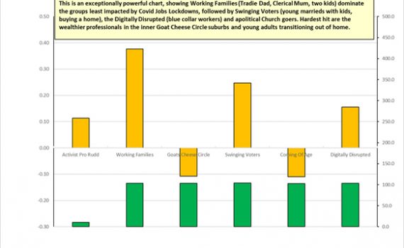
So far, so good. But what happens when we check out the profile of the 20 to 25 percent of jobs which come late to the party? Let’s check out our two Stereotype Charts for August 8, with the top one based on the original data and the second one also showing the revised data in yellow bars.

So far, so good. But what happens when we check out the profile of the 20 to 25 percent of jobs which come late to the party?


Suburban Stereotypes - So far, so good. But what happens when we check out the profile of the 20 to 25 percent of jobs which come late to the party?


The central thrust of the original data profiles shows the big urban and provincial city Working Families and the younger and more aspirational, outer suburban Swinging Voters both faring relatively well from the impact of the Covid jobs lockdown. By relatively well, we mean relative to a (non-Victorian) Australian average jobs loss of about three percent from mid-March to August 8.

When we take a close look at the changes in index numbers for individual occupations and the suburb profiles for where they tend to live, we see that the industries which tend to improve after revision include the better-paid ones we often find in the Goat Cheese Circle inner suburbs, such as professional consulting, finance, media and real estate.

This means our maps for the loss of jobs across inner suburbs tend to look a lot greener after a month or so, after new employer data has been reported from those employers reporting less frequently than every week.

So, until the ABS has amassed enough single touch payroll data over a few years of relatively stable labour markets, to make regular seasonal adjustments, treat the latest weekly data releases with caution, as the revised data a month or so older, is often more accurate.

Just like an old vine Barossa Shiraz, big data often improves with ageing.

Next update, we’ll take a look at the impact of the Federal Budget on those industries most impacted by jobs lockdowns.
Talk to you then.